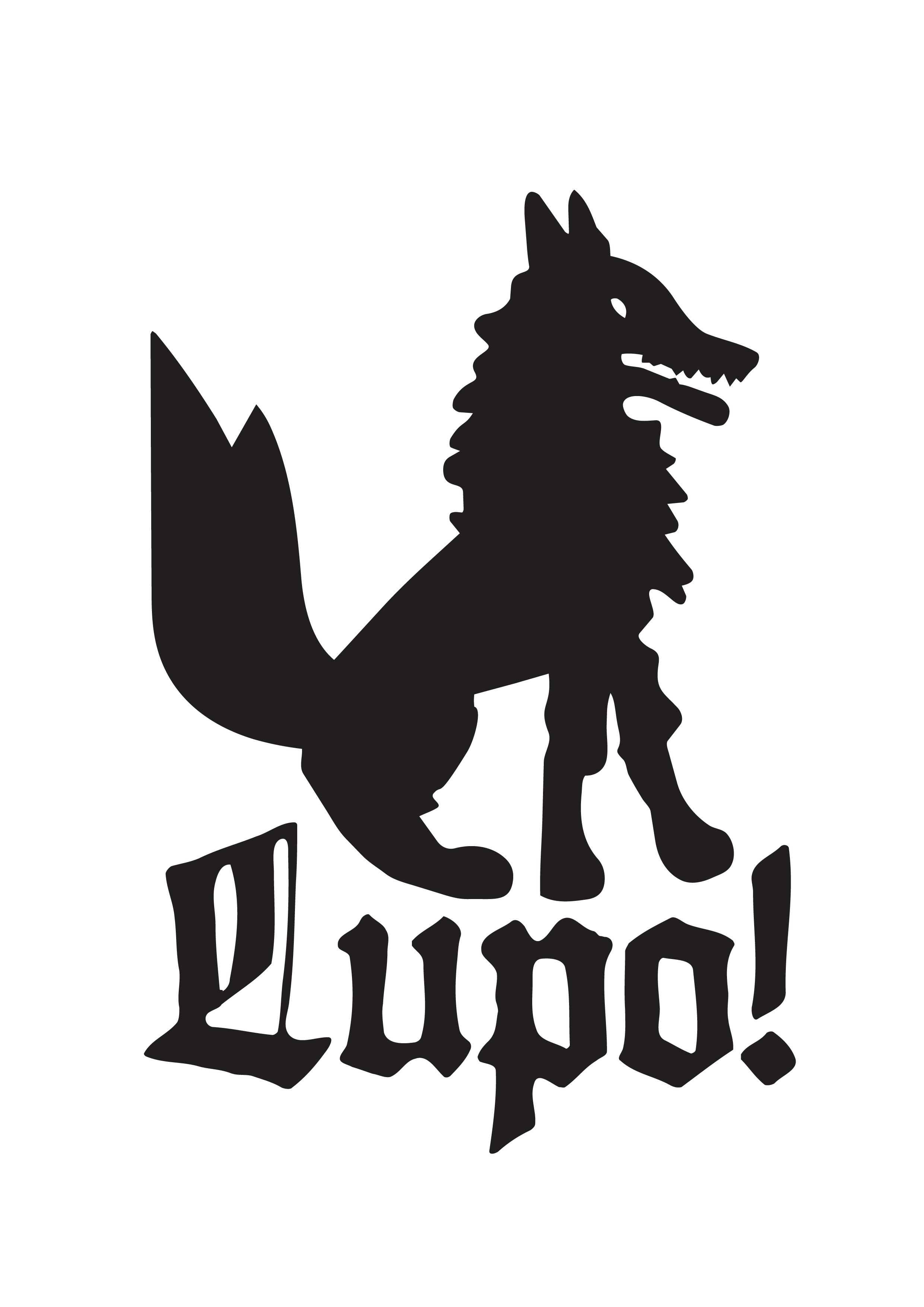
Blending traditional blackletter typography with a modern, playful identity, the branding for Lupo! was crafted to evoke a sense of both timelessness and contemporary design. The goal was to reflect a kitchen rooted in Italian tradition while embracing a forward-thinking and innovative spirit.
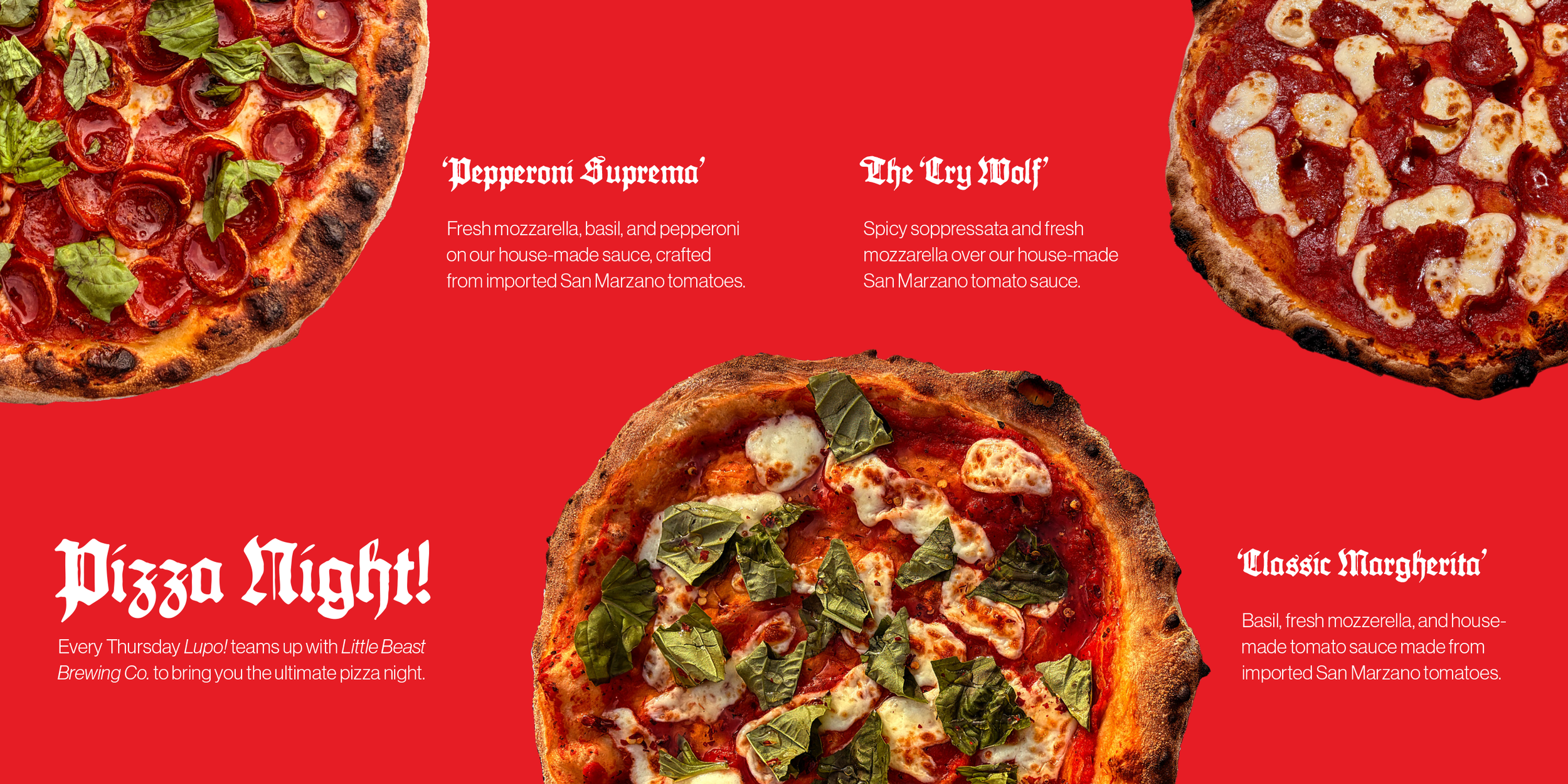
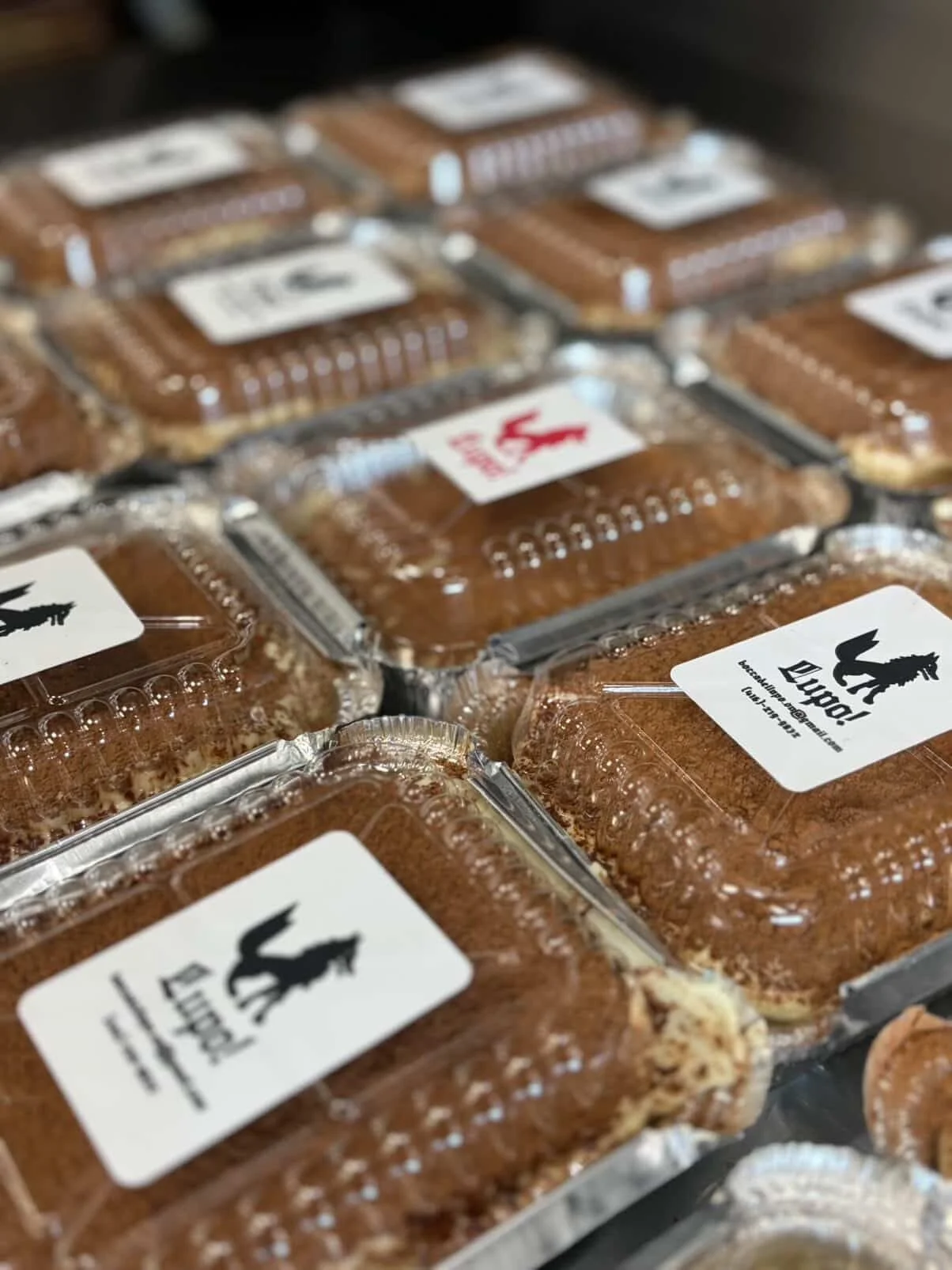
Located in Ontario, Lupo! is a new Italian restaurant specializing in wood-fired cuisine, offering a curated selection of courses, thoughtfully designed meal packages, and indulgent desserts.
The Lupo! logo is a central expression of the brand’s identity, embodying the balance between Italian tradition and modern reinterpretation.
At its core, the mark features a stylized wolf—lupo in Italian—serving as a distinctive and memorable symbol. The wolf references Italian heritage and mythology, evoking strength, instinct, and a sense of origin. Its simplified silhouette ensures clarity and versatility across applications, while maintaining a bold and recognizable presence.
The logo features 2-parts. One, the iconic Lupo! wolf, the other the classic blackletter. These can be separated in different applications.